Top 3 Mobile App Design Trends

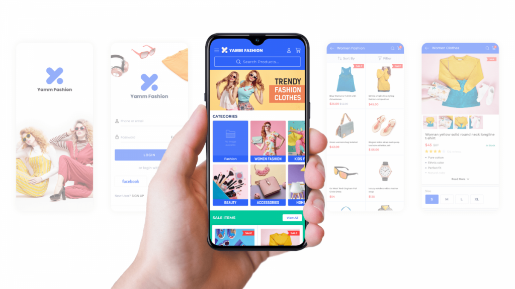
Design is an essential aspect of any mobile application. Mobile app design encompasses both user-experience (UX) and user-interface (UI).
It decides how a user will consume the services of the app and is responsible for the overall theme of the design.
Different app design elements include elementary things like the color scheme, fonts, buttons, widgets, and much more which collectively contribute to the final look and feel of the mobile app.
The main goal of an app designer is to keep the user hooked on the mobile app. And the key to that is to keep the design simple enough to easily navigate, yet extremely engaging at the same time.
Design forms the essential step in any mobile app development process, and anyone who converts WordPress site to Android app must spend time optimizing it as much as possible.
Over the past few years that the technology has advanced rapidly and design has played a major role in this. And there will certainly be many more evolutions in mobile app designs in the coming years.
Let us explore some of the latest and upcoming trends in the world of mobile app design.
#1 - Minimalist Design
This one design trend has been followed by most designers today is becoming more and more popular by the day.
It comes from the minimalist philosophy where the idea is to get rid of everything that is not absolutely essential. Which makes space for the essentials and makes space look bigger than it really is.
Similarly, in the phone app design, the minimalist design gets rid of anything that is not absolutely essential to the experience. This helps the user to focus on what is being served and stay hooked without any distractions.
Finally, it also prevents zero-state, which is another highly overlooked aspect of the app design.
Supplementary read: Zero state: A crucial but overlooked element of mobile app design
#2 - Button Free UI
This trend began when designers started replacing the flashy solid colors in the CTA buttons with empty spaces, that would glow only when you click on them.
However, with the latest advancements in technology, buttons are being removed entirely from the user’s journey on the app. Rather they are being replaced with gestures and signs that mobile phones can recognize.
The most known example is the pinch-zoom, other examples include gestures to open phone camera and click photos.
#3 - Dark Mode
An average mobile user spends about 3 hours daily on their smartphone. And companies have realized the negative impact of the white light streaming straight into the human eyes.
Source: Top 75+ mobile app statistics – Market size & usage
To prevent the same, and as a result, to motivate users to spend more time on apps, many brands have introduced a dark mode or night reading mode that makes it much easier for human eyes to concentrate upon.
This is not only pleasing and friendlier to the eyes but also brings out many new opportunities for the designers to experiment with.
Conclusion
We discussed the three main emerging design trends in the world of mobile app design. With the rapid development, there are surely many more design breakthroughs and trends to come in the near future.
Mobile app design does not just limit to the user interface of the app itself, but also extends to the designs required while publishing the app on the app stores.
Supplementary read:
To keep up to date with the latest trends in the world of mobile apps, follow our blogs where we discuss everything from how to make an app to launching it on app stores, its maintenance, and promotion.
Thank you!
Will be posted after admin approval.


