
Principles Of Effective Web Design For Templates & Themes

Modern qualitative design of templates, themes, applications, extensions for any CMS, whether it be Wordpress, Joomla, Drupal, Magento, Opencart, etc. is based on rules of web design.
1. PATH TO CONTENT
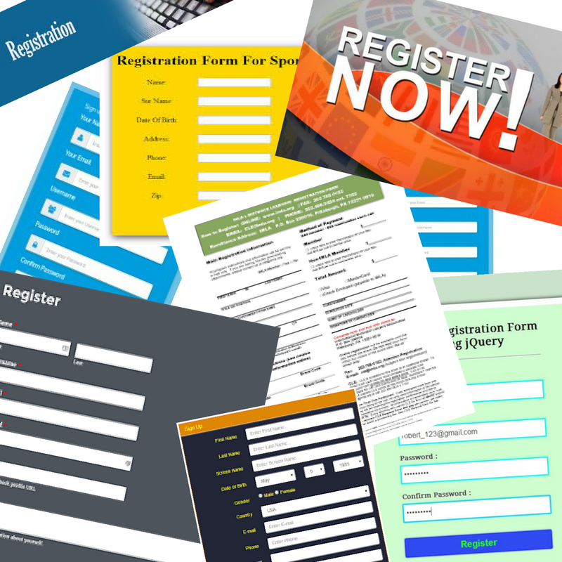
Your Product should be as accessible as possible! Do not hide it behind endless forms of registration,your end user shouldn't experience difficulties with access to your product. Strive to ensure that your users have as few obstacles as possible related to their interaction with your product.
2. ACCENT!

The principle based on stressing the main elements in your goods or service. The easiest ways at the moment are accentuation by image or visualization of work with a product. Don't forget that accentuation is very powerful tool, especially if your product has any strong line for example the special price, exclusivity, usability. example the special price, exclusivity, usability.
3. Know The Measure, The Animation Of Everything Can Lead To Epilepsy
You can always use animation elements in order to show some features of your design, the strength of modern templates is balance in effects, but you all the same should know when effects is too much or they are obnoxious.
4.Your Text
Do not forget that when you write, you write not for search engines - you write for the person, the consumer, the end user with your product, do not try to spray a lot of unnecessary things, do not pour a lot of water, do not go into too artistic description of your product , you must understand what you are writing for your target audience, which means that it should be clear message in the first queue. An important feature is not the use of a local memes, which is understandable only to you and your colleagues at work. For the user it does not carry any information, so it makes no sense. The most important advice is - represent to yourself the person to whom your product is needed.
5. Do Not Overexert The User
Your page should be logically demonstrated and clear to "how system works". A clear structure, where necessary - understandable (most often visual) tips.
Speaking the language of kayaks, the User have to flow along the stream from the links, not meeting on the way snags that could have made it difficult to achieve his goal.
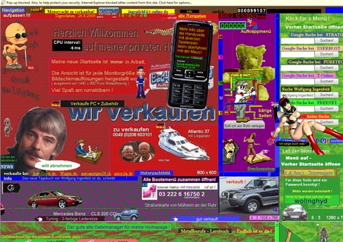
6. Strives To Simplicity

Strive for the simplicity of your elements, because trying to be wise you can go to the fact that you will outplay yourself. Modern trends of web design are management and clarity. You can now quite observe that simplicity now rules the market of the modern industry of sales and services. But don't think that your end user comes to the site for the sake of your mind-boggling design, he does it in order to get some information, so don't prevent him to do it.
7. Do Not Be Afraid Of Empty Space
Fear of empty space can lead to the fact that you can complicate the perception of your content by use of lines which will separate visual content from other elements, you protect it from the possibility of independent own mental separation for the most convenient perception.
8. Effective Communication By Content

To fulfill this condition, we strongly recommend that you take for yourself 3 principles.
Organization: The user understands how the system is organized, he does not need additional manuals in order to understand how to use your resource
Saving: Do not overload or burn your eyes to your users, remember that it's very easy to overdo if you try to add more visual effects. Don't add anything by principle of "Everything is the most important". Try to clearly understand, how useful content looks. If you are not able to do this - find a professional. Your content is the basis of your website
Interaction: Remember, that web design and the art of typography have one basis- there are basic rules of readability, perception of the font, color and much more. Your task is to make the text as readable as possible
9. Don’t Reinvent The Wheel
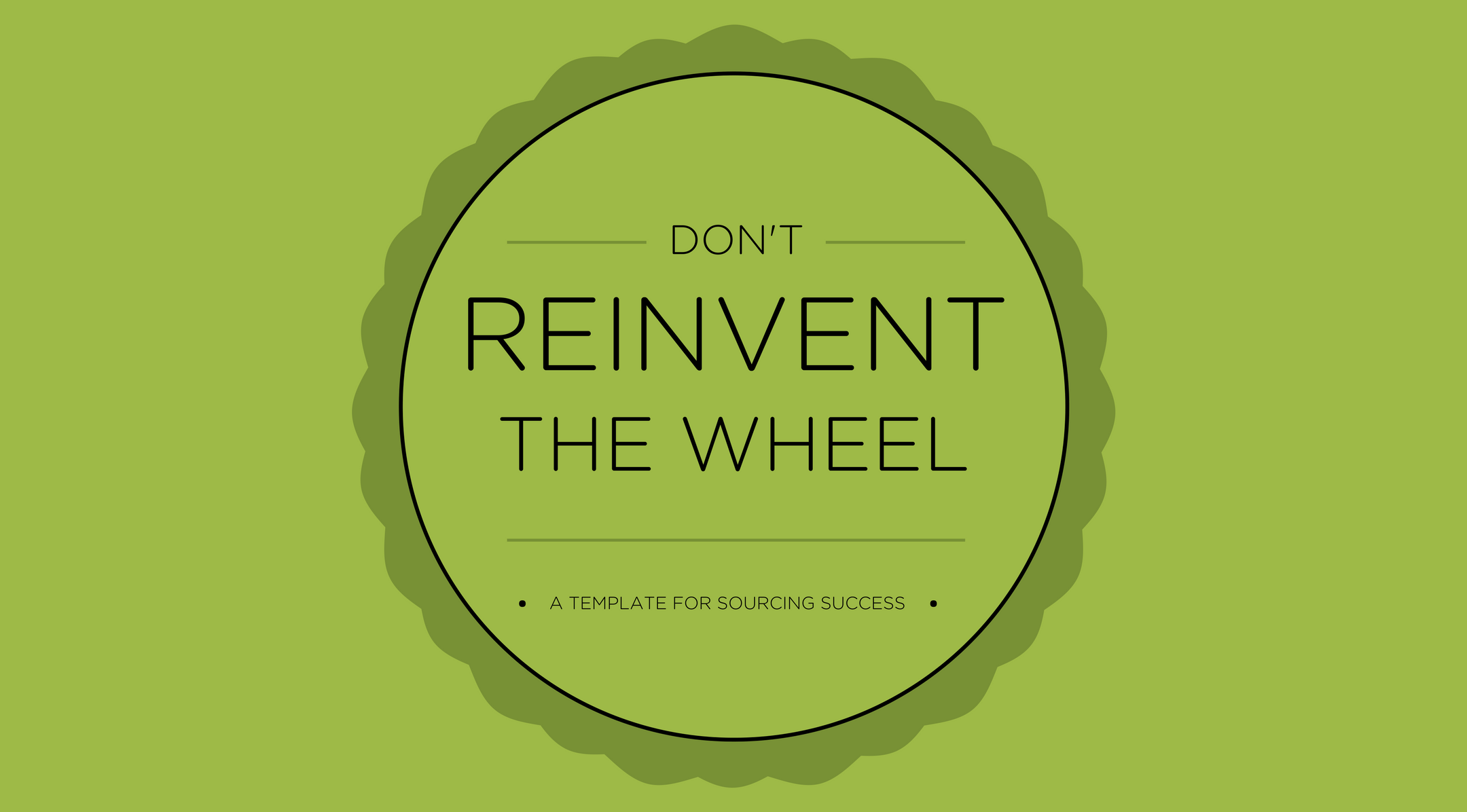
Remember that in world of industry of web design there were already certain traditions and schemes of giving of content, so we don't advise you without special need to change them. Imagine the website which you consider the most clear and convenient. Most likely he has the structure which has developed already in society of web users, that it will be clear already at the intuitive level for the new user.
10. Test Early, Test Frequently

Always test and run your projects for working capacity. because in spite of the fact that everything seems to work in the aggregate result, the elements can live separately from each other. Strongly advise, if you have something conceived - find a third-party user who could completely run through the chain of use of your site. You never know 100% where something can go wrong. Even if it is something big and tedious. If you find the problem in this way thats can save you from negative perception of our product. Even if you think that your product is ideal you should remember, that for developers often difficult to identify errors in own projects.
So, important thing that templates solve many tasks listed above, but they are also created by people and can have some mistakes.

YOU ALSO CAN READ:

Funny theme!
Thank you!
Will be posted after admin approval.